Psychology and the web
By Team Arrk |
|
7 mins read |

As the web proliferates and we interact with it in numerous ways, we need to be aware of the importance technology plays in satisfying human needs when interacting with a web application. There is another aspect that we perhaps do not pay as much attention to which is the psychology or the mind-play that happens when we interact with the web. This article explores this topic and tries to enliven the somewhat ‘obscure’ portions of what happens when we go click-click-click.
The Influence of Past Experiences
We carry within us previous experiences of having dealt with web applications / websites, experiences positive or negative, pleasant or unpleasant, successful or otherwise which impacts how we interact with a (new) website. There are some standard ways of interaction with the websites that we are conscious of (e.g. back button to navigate to the previous page, login / registration process) and not having these standards in place or working as before causes delay, inconvenience and frustration that can make us want to move away from such websites, maybe forever. These standards help users to navigate faster, with their expectation of what is to follow getting confirmed, and resulting in a feeling of satisfaction. When there are several confirmations, they become patterns translating to feelings of happiness. (Indeed, this does not mean that a “standard” is equivalent to “no innovation”, absolutely not! But a set standard can ONLY be ignored provided usability is improved. Jeffrey Zeldman wisely said, “consideration beats pattern”).
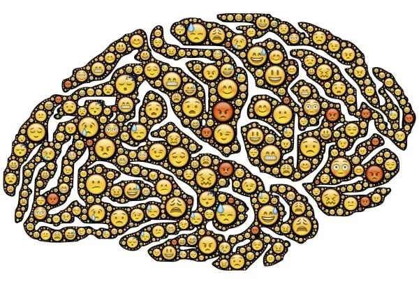
Emotions
There is no doubt that the first interaction with a website conjures some emotions that connects or dispels us from carrying on working with it. Apart from the correct functional workability of the website in providing us what we want, the web elements including the images, colour, layout, white space, and so on, impact our ‘emotional experience’. As much as these do, even the quickness the website exhibits when it ‘responds’ to our command and results that get shown also matters.
Let’s look at these emotions influencing elements in greater detail.
Colour | less is more
It is known that a particular choice of colour or colours used together evokes a certain mood and stirs emotions within us. Colours can make us feel happy or sad, relaxed or anxious. Research has also proven that people are strongly influenced by colour when they decide to buy. For example, Red draws attention, is a colour of love, passion and gets the blood pumping with excitement while Green stands for cleanliness, health, prosperity and completeness. Pink and Blue are known to appeal to women more than men.
When we interact with the web, we associate colour with the intent of the messages i.e. when the message is in Green colour we associate that with success and those in Red with failure or warnings issued (say to correct an incorrect input). Wouldn’t a hyperlink lose meaning if it was not in blue colour (see what I mean)?
Websites sometimes employ the colour(s) of the brand to help brand-recall. But generally it’s best to use few colours to keep it simple. Garish colours or flashy colourful elements are a strict no-no from a disability discrimination perspective since they unduly impact visually impaired people or may induce epilepsy in afflicted people. An example that comes to mind is the controversy around the London 2012 Olympics logo.
Simple Layout is powerful
In a 2012 study from Google and the University of Basel, researchers found that users judge a website’s aesthetic beauty and perceived functionality in 1/20th to 1/50th of a second. We thus take decisions in an instinctive and instantaneous manner. The ideal website is, therefore, one where we see and find what we want within a blink of the eye. Here the Google page resonates eminently from a simplicity and usability perspective. When our eyes set sight on its page with all but a text box in the centre encircled with white space, the mind quickly figures the words to type in and we are off in a flash. The experience is further complemented by a quick response that makes us happy to ensure we visit it again (and again).
We have grown to expect certain elements to be located in a certain (prototypical) location and our brain gets confused if it does not find it there. For example, can you imagine the ‘next’ link located away from the page nos., links displayed in the pagination footer or the ‘checkout’ option on a shopping cart website located to the left instead of on the right?
In short, a simple layout makes it comfortable for the user and there’s lots of power in that. We want things to be simple and easy because of psychological reasons:
- We generally want more by spending less effort. So instead of words, if images and examples can be used the interactive experience becomes faster and more comfortable;
- Not all brains can process humongous elements of text hence we need to have headers or text in bold or in large font to break things down and ease it out;
- Our memory doesn’t stay young forever and remembers only what it needs to;
- Our level of concentration is susceptible to not stay sharp all the time;
- There are aural and visual issues that some people suffer from. While the web must cater to their needs to make web universal, there is a parallel need to use visually appealing and innovative design to attract and focus attention for those who are not.
The web designers and developers need to be mindful and build accordingly, suiting the context of the product and its users to ensure the desired outcome.
Games that people play and why?
Is there any psychology behind the enormous success of Angry Birds and now Candy Crush (many times over)? Why is a child-like game so intensely popular even with adults, whatever their dispensation? Well, both these games are on the surface simple to play, very colourful with very appealing background sound elements. Angry Birds would not have been as addictive without the sounds of pigs rejoicing, grunting and what have you. There is even an element of ‘nostalgia’ that Candy Crush induces by playing to our ‘those-were-the-days’ (childhood) mindset.
In a laboratory, rats are induced to work with scientists with tidbits of food offered at specific intervals of time as a rewarding means of telling them that they have done their bit. This constant gratification encourages them to cooperate with the scientists in an uninterrupted manner. Likewise Angry Birds and Candy Crush work on an ‘Action-Reward-New option’ strategy interspersed with pleasing sounds, additional points, bursts of colour and new levels being accessed that spur the player on, be it a man of 60 or a child of 5 years. As is, this is playing on the mind so age does not really matter.
Even being part of or creating a sense of order contributes to our addiction or immersion into games be it SIMS, World of Warcraft where we create/architect beautiful landscapes. In such roleplaying games the addiction happens since we can play and cater to the secret, innate desires of our minds to control and become stronger, more skilled and so on. Such games play like a dream and we get sucked into the experience seemingly lost to the real world.
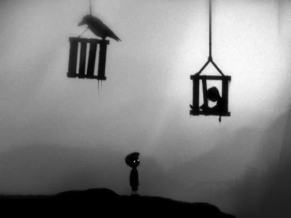
A personal favourite worth a mention is Limbo, screenshot above, in which, as the story unfolds, a little boy advances through multiple challenges, encountering monsters, tricky landscapes solving puzzles along the way. The visually stunning ‘arty’ grayscale environment adds greatly to the mystique and it succeeds and impacts the mind, despite sound used minimally (unlike Angry Birds & Candy Crush).
Crowd emotions
No article of this kind will be complete without looking at the psychology of group emotions at play. An interesting example is that of Facebook. Why has Facebook succeeded and why have its members opened the doors into their private lives they once so scrupulously guarded? (Funnily despite our data being sold by Facebook we seem not bothered). It stems from the feeling of wanting to be accepted, feel better (self-esteem), to be ‘liked’, to air one’s grouses in the open, hopeful of assurances etc. We also seek gratification and approval for our looks when we post photographs of ourselves and family.
We have seen here that web development cannot ignore the psychology so inherent in everything that we do be it online shopping, banking or play. As much as we need to make the best use of technology employing optimal practices with requisitely skilled people to develop software, ignoring the mental aspects of what goes in the end-user mind with respect to colour, emotions, ease of use, speed and so on will be completely at the peril of the outcome we want to derive.
References
The psychology behind successful Web design
5 psychology secrets for great interaction design
The Psychologist’s View of UX Design
My favourite waste of time: why Candy Crush and Angry Birds are so compulsive


