Cross Browser Testing Conundrum
By Shailendra Matkar, Sandeep Maher |
|
4 mins read |

Testing applications which utilise Web Browsers is becoming increasing more complex. In the early 1990s, successful testing with a copy of Microsoft Internet Explorer and Netscape meant that you could be confident that the vast majority of users would be able to reliably access your application.
Multiple browsers from many different providers are now in use and while we expect standard and consistent content delivery to the end users, unfortunately, this is often not the case. In addition the use of mobile and tablet platforms have introduced more web browsers and other variables which need to be tested.
The tester therefore now has to consider the various permutations of different hardware platforms, browsers, browser versions, operating systems, screen resolution, network speed, etc.
Browsers and new releases:
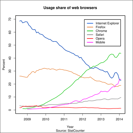
The browser market is now diverse with many different browsers being used by high volumes of users. In addition the usage of the web continues to increase, and web applications become richer in content and utilise complex functionality. The graph “Usage share of web browsers” demonstrates the changes in web browser use over the last few years.
The standards for client-side technology are still evolving and these inconsistencies may lead to cross-browser issues. This can result in a web page look & feel and/or screen behaviours to be different on different browsers. Testing needs to ensure that every supported web browser delivers the expected content to the end user.
In addition each browser provider makes regular update releases*. Users often lag behind and continue to use old versions of browser software. Therefore the tester needs consider not only which browsers but also which versions that are to be tested.
Platforms:
Browsers were initially linked to the operating systems used. For example, Safari was the default on Mac systems and IE was normally used on Microsoft Windows systems. Over time these ties have been broken and now users are free to use their browser of choice. Whilst this is great news for the user, the tester needs to consider further permutations.
The increasing use of mobile and tablet platforms has also increased the number of browsers in use. For example, Android, Safari Mobile, Opera Mini as well as more proprietary offerings such as the web browsers on Blackberry and Nokia Symbian platforms. Suddenly the browser testing combination matrix grows exponentially. The mobile market also introduced other variables . For example, a multitude of different screen resolutions/formats and also less reliable connections. All these variables create a perfect storm for the tester, who has to consider the various permutations of different hardware platforms, browsers, browser versions, operating systems, screen resolution, network speed, etc.
Browser Architecture:
Most browsers use the same underlying architecture using components such as UI, Browser Engine, Rendering Engine, JavaScript Interpreter, and data store. Despite this each browser delivers a ‘proprietary’ look & feel and has different performance aspects. Although server side components are more or less standardized the client side technologies continue to evolve competitively and are therefore prone to idiosyncratic behaviours.
A browser’s layout engine which parses HTML tags and applies to the relevant elements the style information contained in the CSS style-sheets may deliver a different presentation of content across different browsers.
The Document Object Model (DOM) often continues to differ from the W3.org standards which makes rendering inconsistent, although this problem is steadily being reduced.
Each browser has a default stylesheet for HTML elements that defines the appearance of elements that have no style associated with them. An example of this is the different appearance of buttons and form elements across browsers.
Local resources (such as fonts and browser plug-ins) may affect the way a page is rendered. If a specific font is unavailable, the browser will choose the best match from the set of available fonts on the system. Since the browser makes this choice, different fonts may be chosen by the various browsers. The user may therefore see different results across browsers.
Most web browsers are lenient in the case of HTML pages that contain missing, misspelled, or misplaced HTML tags. Each browser, however, may handle such pages in a different manner, as there is no standard that describe how to do handle these anomalies.
Thus Cross Browser Testing needs to be able to check for different results – from minor cosmetic problems to major functional anomalies.
Development Considerations:
Since developers don’t have direct control on the client side technologies, web application development and unit testing is often only conducted on the developer’s favourite browser (say IE). This means that implementation using other browsers (say Firefox) would remain unproven. Some browsers have extra features available which may produce unexpected behavioural or functional issues.
Summary:
It is clear that Cross-Browser Testing needs to be considered early within test planning. The platforms to be supported must be considered and agreed prior to any test execution. Techniques for detecting and fixing these issues are still relatively immature, but it is unrealistic to expect a tester to test web pages manually for all the possible permutations, as this is an impossibly massive task.
Browsers will continue to evolve and multiply. Testing applications across multiple browsers is an issue that must be tackled intelligently to ensure that a satisfactory end-user experience is delivered.
*For example In 2013 Chrome released 8 versions and Firefox released 9 versions. IE and Safari have released major upgrades. For more information refer to the browsers timeline. Refer to the browsers timeline here.


