Google's Mobilegeddon and the Importance of Mobile First Development
By Team Arrk |
|
4 mins read |

Back in April 2015 the world’s most popular search engine Google started to roll out its latest major algorithm update for its core search service. Dubbed ‘Mobilegeddon’ in some quarters, the update was first officially confirmed by Google in late February on its central webmaster blog.
As with all major algorithm updates, the ramifications for organisations which rely on organic search position can be huge – in some previous update instances businesses have had to fundamentally change to survive while others have withered away as their visitors go elsewhere.
What shouldn’t be lost when considering why Google makes these changes is that the company wants to continue to provide what it considers to be the best search engine on the market and thus protect its main source of revenue. Just as with Panda and Penguin updates that came before, this mobile-friendly update is just part of Google’s quest to provide the most relevant results for any given search and this latest change sees mobile-friendly pages receive a boost on mobile search results compared to results which aren’t classed as mobile-friendly.
We have all been there; performed a search for something on our smartphone and hit a webpage which offers a really poor experience: trouble reading the tiny text, lots of screen pinching, unresponsive buttons. What do we do? We rarely battle away instead preferring to select an alternative webpage better configured to our smartphone.
According to comScore, mobile now outstrips desktop in the volume of global internet users, while speaking at a conference in 2014, Google’s very own Matt Cutts, head of Google’s Webspam team, admitted he wouldn’t be surprised if mobile search exceeded desktop queries as early as late-2014.
How does Google define mobile-friendly?
In a nutshell, Google believes that a high quality mobile-friendly page, not only contains good quality, unique content which the searcher wants to consume but that it can be consumed without the need to tap or zoom, that tap targets (where you put your finger) are appropriately spaced, horizontal scrolling does not occur and that unplayable content is avoided.
Sounds simple right? Not necessarily, however all is not lost as Google has also released and supports a handy tool which grades any website for its mobile-friendliness, even suggesting how to improve a user’s experience when consuming the website on a small screen.
Google’s move towards favouring mobile-friendly search results is there to be seen. Perform
This wholesale shift towards embracing small touchscreens means that when it comes to software development a mobile first philosophy is now generally a prerequisite.
What does Mobile First mean?
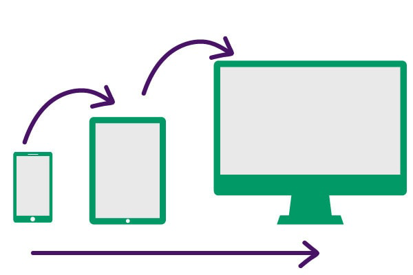
Mobile first literally means that all designs for a digital product is created for a mobile device initially. A mobile device for prototyping purposes is defined as having a portrait screen in which a single column of content is presented. There are scenarios where a landscape screen orientation would be advantageous, however they should be considered the exception rather than the rule.
At Arrk Group, mobile first is used as a reductionist strategy during the creative sessions of our customer EmbArrk™ workshops. This means that all paper prototyping is designed around producing content targeted for a mobile screen. This inherently removes focus from extraneous screen elements such as footers, tooltips, menus and brandmarks, instead the presentation of pertinent screen content is paramount.
Designing for the smallest screen size also offers the advantage that scaling for a large screen, is generally a simple task of taking advantage of the extra space available. However reducing a desktop screen design for mobile is an expensive activity, and when a process such as ‘graceful degradation’ is employed, the mobile offering naturally becomes the poor relation of the larger design.
Tips on how to do mobile first design
- Ensure the development team knows what mobile first means
- Design the digital product from the ground up to be mobile first, even if the primary use case is desktop
- Use a toolset that is mobile first and responsive
- Build a design, develop, test & review cycle that includes mobile devices (both physical & emulated) in the plan
What is a ‘mobile’ device?
The definition of a mobile device is continually changing, however the screen width has emerged as the key indicator for device type.
Bootstrap v3.3.4 classes all screens into the following groups (the dimension refers to the screen width);
| Description | Screen Width |
|---|---|
| Extra Small Devices Mobile | <768px |
| Small Devices Tablets | ≥768px |
| Medium Devices Desktops | ≥992px |
| Large Devices Desktops | ≥1200px |
This method removes the need for determining whether a device is a phone, a phablet, a tablet, a net book etc.
Of course digital wireframes/simulations for 4x variants would be exorbitantly expensive, so developing 2x variants (essentially mobile & desktop) with a breakpoint at 900 px is an effective compromise.
Impact on Search Results
According to research performed by searchmetrics the share of mobile-friendly appearing in the first three pages of any given search on Google has increased by 3%, which accounts for 71% of the first three pages of results.
The flip side being that only 29% of results on those first three pages are deemed by Google to be mobile unfriendly. Econsultancy has also looked into the impact of the Google Update, with some interesting results for some of the UK’s major businesses, such as Barclay’s, ASDA and British Airways. The conclusion being that the algorithm update has had the desired impact of pushing mobile-friendly pages up the rankings while dragging down unfriendly pages.
Perhaps not a seismic fiction that some industry commentators were predicting however it is further evidence that employing a mobile first strategy when developing is vital for the long term viability for that digital product.


